codeConnects Portal
A centralized platform for students and instructors alike to interact and promote learning. The portal is the backbone of communication for those engaged in codeConnects programs. By streamlining interactions between users, the portal allows students to learn and instructors to teach at their very best.
Role: UX Research, UI Design
Duration: June - August 2021
Tools: Figma, Adobe Suite
Role: UX Research, UI Design
Duration: June - August 2021
Tools: Figma, Adobe Suite
The Research
Given the time frame, I had to focus my research on the primary populations that would be using the portal. I sought to better understand the habits of the students and instructors who were two sides of the same coin.
I explored how instructors would give lessons, post/grade assignments and keep track of their students, and how students would react to each of these actions.
I explored how instructors would give lessons, post/grade assignments and keep track of their students, and how students would react to each of these actions.
User Personas
Through initial interviews I established two main personas involved in the experience.
Gathering Insights
Existing Solutions
• CCLE/Canva — The most impactful functions are all present, but navigation options are excessive and it may be difficult to pinpoint information.
The Instructor Perspective
• Different instructors teach different classes, the same framework that can organize a class of five students also has to be applicable to a class of fifty. Attention should be able to be given to each individual student.
The Student Perspective
• First and foremost are their grades, and anything that directly affects it. This includes things like homework assignments, lecture videos, and course materials all of which should be immediately accessible.
“How might we enable students and instructors to better organize their academic responsibilities?”
Putting it all together
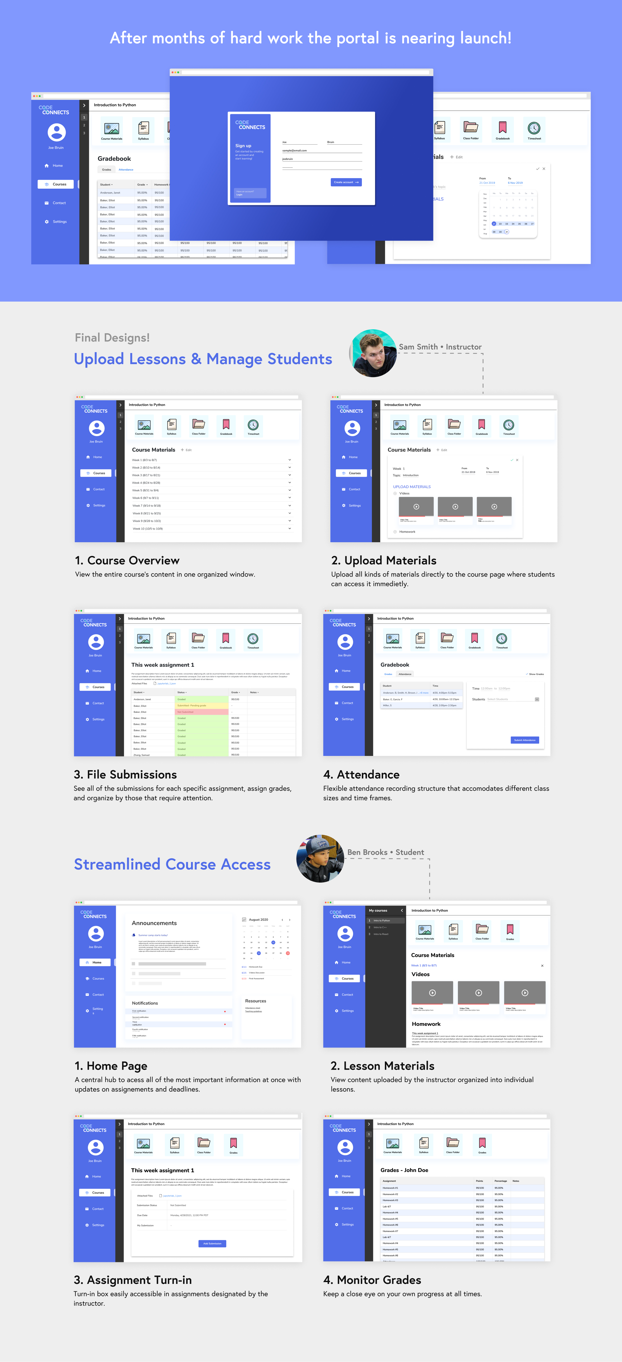
It was now time to combine all the pieces of the puzzle into a tangible experience. The insights gained from user research, along with the two personas were the primary focus of the solution.
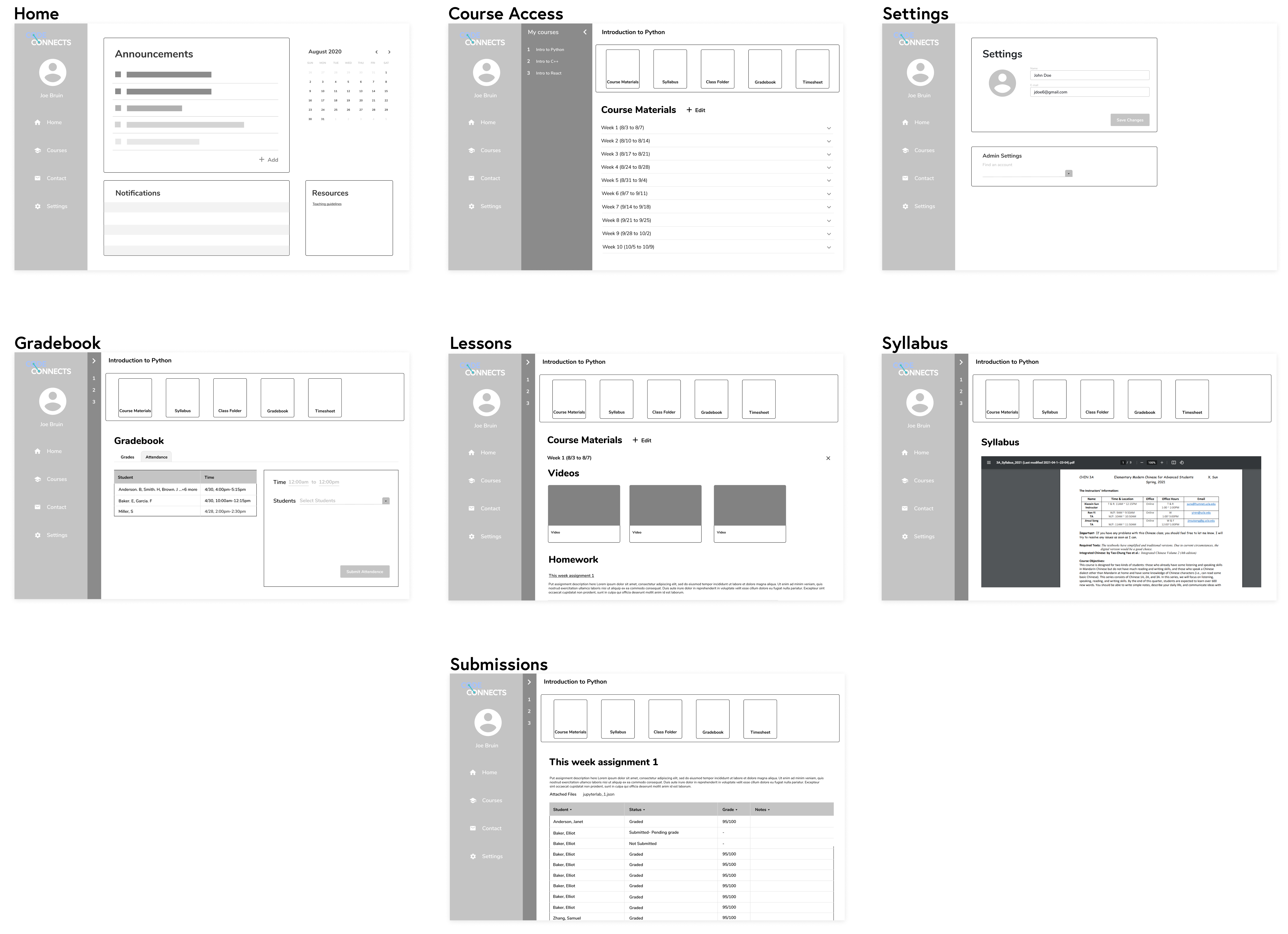
After exploring paper prototypes I created wireframes for the main features and navigation.
After exploring paper prototypes I created wireframes for the main features and navigation.
More feedback and testing!
While the core of the navigation was sound, some users were having difficulties finding pages with more niche uses. Instructors specifically had much more responsibilities than students and needed these to be built in to the portal.
I wanted the instructor side to reflect a higher degree of agency while still maintaining similar navigation options to the student version.
I wanted the instructor side to reflect a higher degree of agency while still maintaining similar navigation options to the student version.
Challenges and lessons learned
Being my first dive into a corporate assignment the process initially felt very different than my previous experiences. Instead of collaborating with other designers the direction of the project was managed by supervisors who I presented my work to and the features they needed to be implemented. While being built from the ground up the portal still had to meet certain criteria like current branding, developer limitations, and deadlines.
Ultimately I found that when interviewing users or reviewing prototypes people aren’t always sure of exactly what they want. This sentiment manifested in a few different ways. Sometimes users wouldn’t be able to articulate what they didn’t like but instead would just mention something “felt off”. Other times supervisors would want to implement features a certain way, but when I introduced them to an alternative would end up liking that better. Overall I learned to better analyze feedback in certain contexts and use it to identify weaknesses in the design.
Ultimately I found that when interviewing users or reviewing prototypes people aren’t always sure of exactly what they want. This sentiment manifested in a few different ways. Sometimes users wouldn’t be able to articulate what they didn’t like but instead would just mention something “felt off”. Other times supervisors would want to implement features a certain way, but when I introduced them to an alternative would end up liking that better. Overall I learned to better analyze feedback in certain contexts and use it to identify weaknesses in the design.