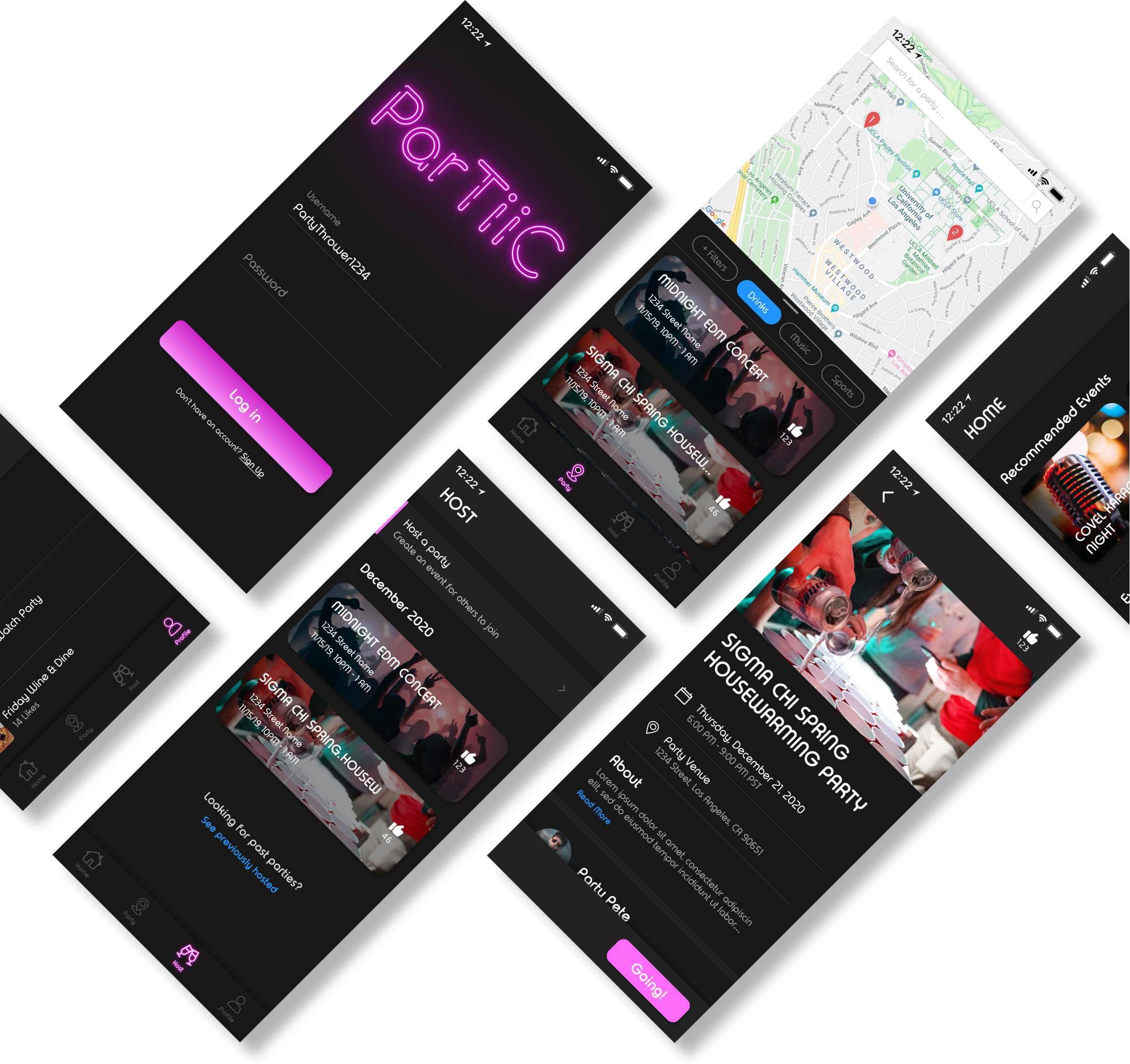
Partiic
Duration: Winter Quarter 2020, 6 Weeks
PURPOSE
The right party can be a lot of fun. Finding the right party on any given night though, is a very daunting task. ParTiiC seeks to streamline this interaction by consolidating all nearby events into an accessible interface.
TEAM
Project Manager • Norman Xavier
Front-end Developers • Maya Raman, Chelsea Wang
Back-end Developers • Parth Deshpande, Rohan Battula, Pranav Madalli
Designers • Leia Ku, Colleen Li, Jimmy Zhang
ROLE
As the Product Design Lead, I used Figma to collaborate with other designers creating wireframes, prototypes, and branding icons. I also kept in close contact with our PM and front-end to for quality assurance. Working with a full, genuine team of designers and developers was incredibly humbling and gave me an huge amount of insight into the teambuilding process.
The Problem
When constructing ParTiiC we wanted to devise a solution to issues we as college students experienced ourselves.
To hone in on our vision of the app we developed a problem statement: How might we encourage interactions between students outside of an academic setting?
To hone in on our vision of the app we developed a problem statement: How might we encourage interactions between students outside of an academic setting?
Users & Audience
Initially, our attention was focused on college students who were already actively looking for interactions; we thought that this would be the best fit for a target demographic. However, upon further discussion we discovered that we could create a solution that not only helped those looking to party, but could be accessible to new users who have never partied before.
Sometimes we get excited and envision our solution with the ideal users behind it. Instead we should be thinking about the audience first and creating a design that best fulfills their needs.
Sometimes we get excited and envision our solution with the ideal users behind it. Instead we should be thinking about the audience first and creating a design that best fulfills their needs.
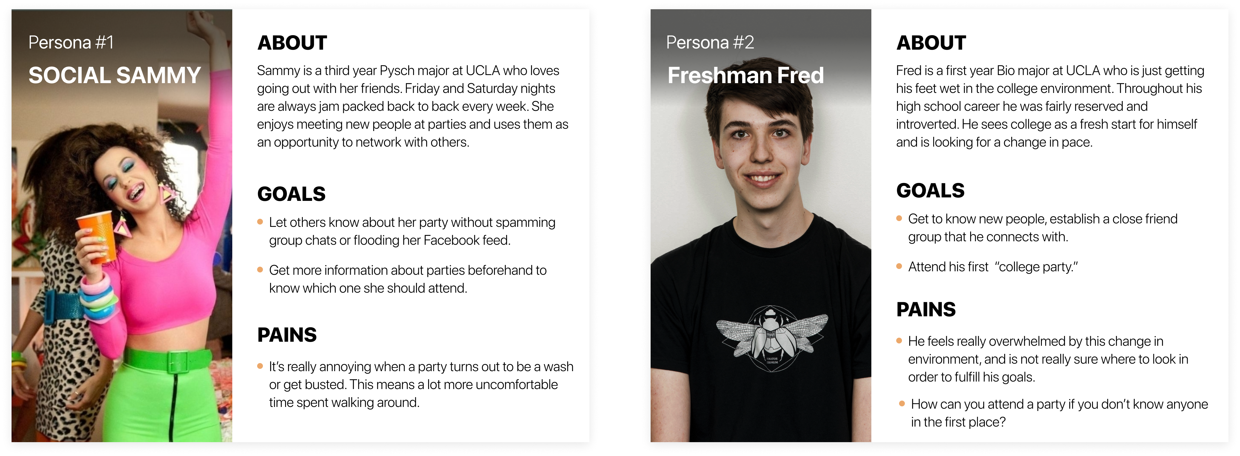
User Personas
In order to conduct a holistic review of our audience we did some preliminary interviews and constructed user personas to work around. These allowed us to consolidate the the pains of our users and focus on solving the most pressing issues.
Brainstorming Baby Steps
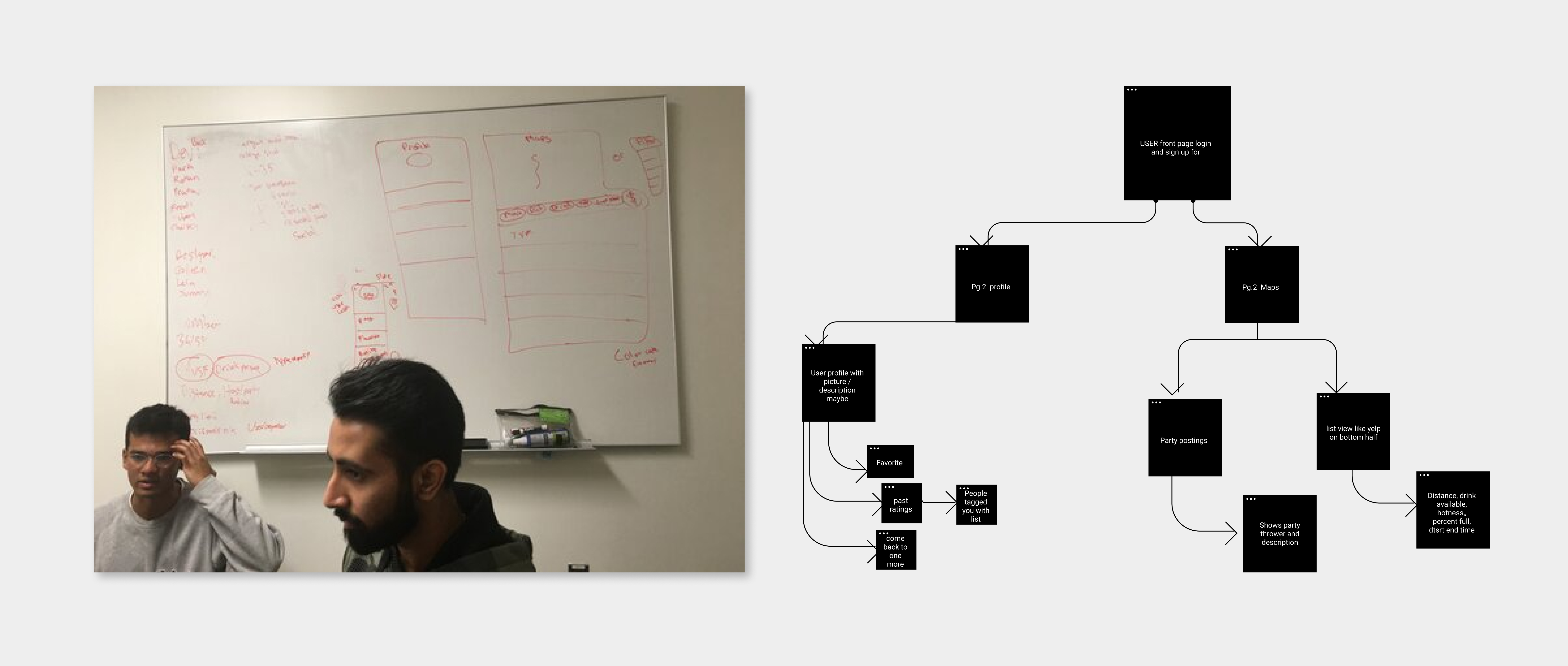
It was time to get our hands dirty, and during the first week we wanted to set up a comprehensive user flow that would lay the foundation for the visuals to be implemented in the future.
Afterwards, we started with white-boarding to see what a tangible solution might look like. Here I believed it important to adopt a yes-and mindset with the other designers. In the product’s infancy we wanted to look at all forms that a possible solution could take. We could always trim the fat later, and without and open mind we might miss out on some great ideas.
Afterwards, we started with white-boarding to see what a tangible solution might look like. Here I believed it important to adopt a yes-and mindset with the other designers. In the product’s infancy we wanted to look at all forms that a possible solution could take. We could always trim the fat later, and without and open mind we might miss out on some great ideas.
Putting pen to paper
Now that we had developed a clearer image of what we wanted to our app to look like, it was time to use software to turn it into something we could use. A very simple prototype using low-fidelity wireframes was established in order to get usability testing up and running ASAP.
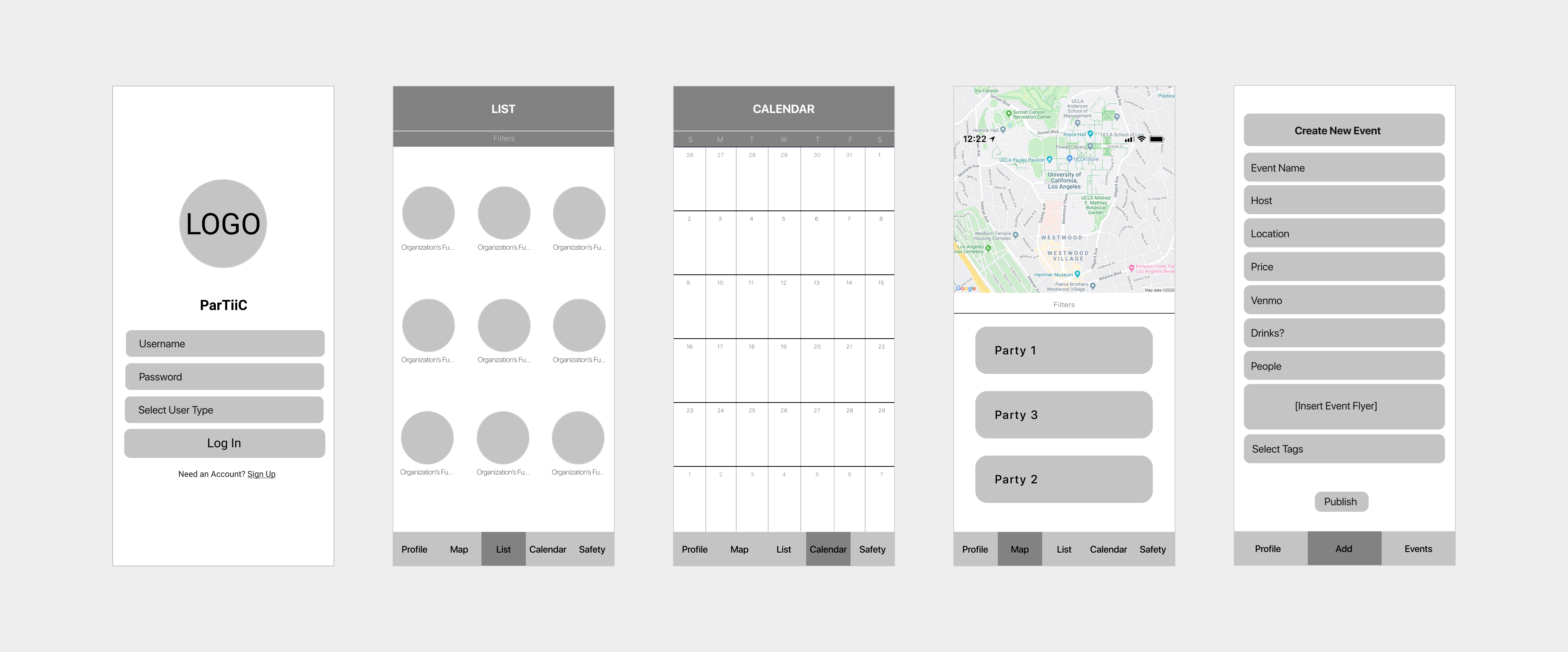
After first iterations...
We realized we had gotten too excited about all the things that this app could potentially be. Trying to implement cool features isn’t a bad thing, but it was important to consider that there was a limited amount of space in order to maintain an intelligent flow.
Thankfully, our users let us know right away, and we sought to make changes in usability and overall convenience.
Thankfully, our users let us know right away, and we sought to make changes in usability and overall convenience.
Take Two
Cutting some of the less impactful features lent itself to a much more simple design, one that felt a lot more natural to work through. A lot of times the best designs are the ones that you don’t notice at all. Now usability tests showed more consistency getting from point A to point B.
Moving forward we wanted to work with colors, typography, and logos to see which tested best with our audience.
Moving forward we wanted to work with colors, typography, and logos to see which tested best with our audience.
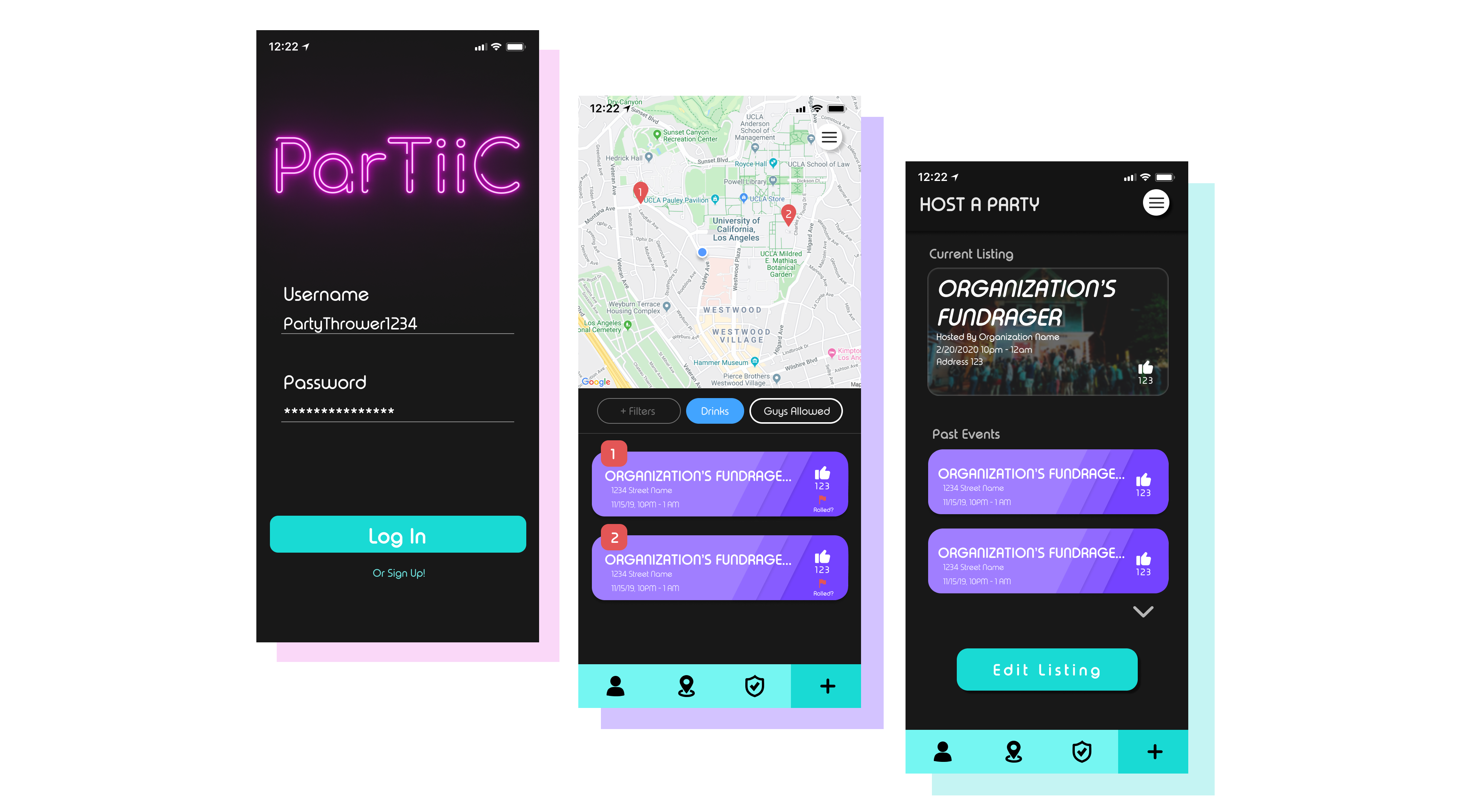
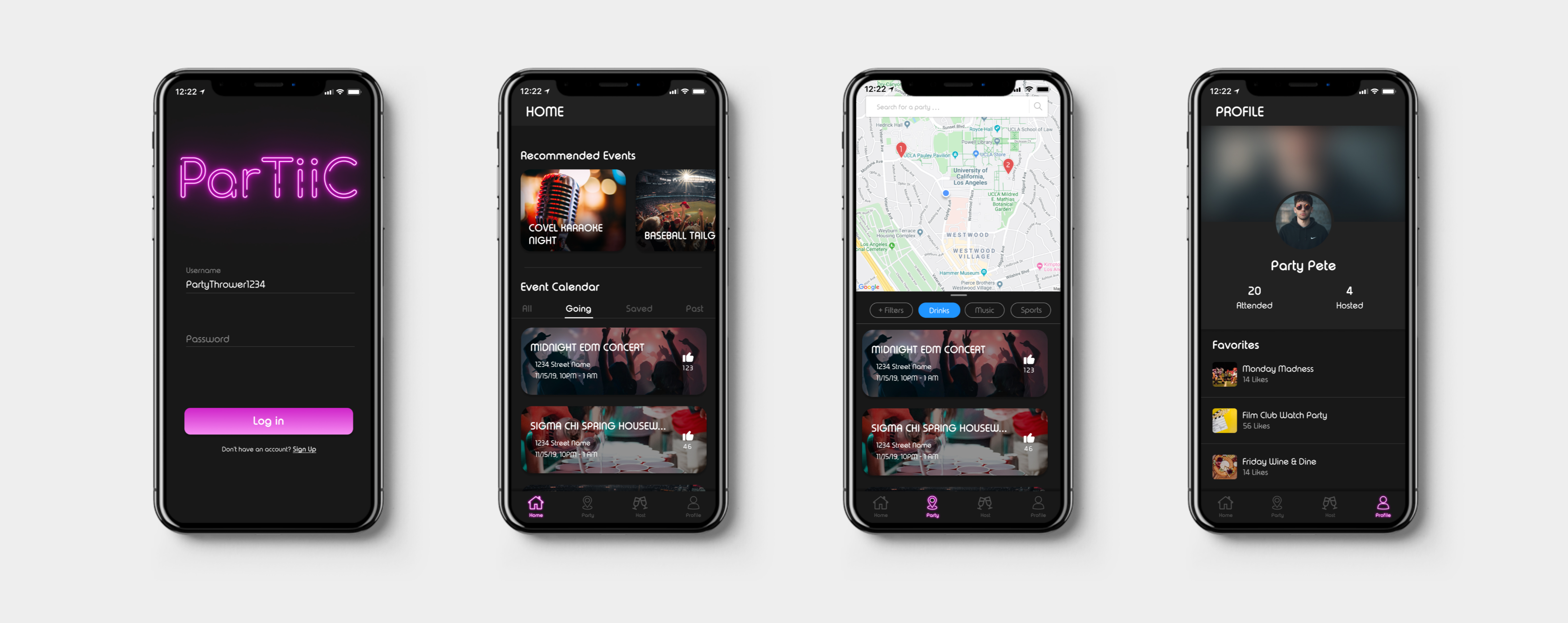
Making the MVP
After three rounds of testing we were getting towards the home stretch of our project deadline. Users really seemed to enjoy the ability to find and host parties with only a few taps. Most of the important information about a party was easily accessible without any clutter.
Eventually we noticed onboarding was a point of friction for some users who displayed confusion around the login screen. Initially we had separate logins for those looking to host parties due to its unique functionality. However after looking at the testing results and reexamining our problem statement we decided to integrate the hosting function into the base product.
Eventually we noticed onboarding was a point of friction for some users who displayed confusion around the login screen. Initially we had separate logins for those looking to host parties due to its unique functionality. However after looking at the testing results and reexamining our problem statement we decided to integrate the hosting function into the base product.
Working with the team
Throughout this whole journey I learned pretty fast that team communication could make or break the product. I kept in close proximity with the engineers and led the step by step through the design process, making sure to let them know any time changes were made. Something that might seem simple to us could take a huge amount of resources to develop, so we were always looking out to make their lives easier.
The collaborative design process was something that I wasn’t super experienced with going in, but learning to work with the other designers and efficiently build on top of each other worked wonders for the process.
The collaborative design process was something that I wasn’t super experienced with going in, but learning to work with the other designers and efficiently build on top of each other worked wonders for the process.
For the future
Test! Test! Test! Make Revisions! ParTiiC is far from perfect as it stands. The flow can be improved and things can be changed to make interactions more intuitive for the user.
In the very near future we plan to release the app on TestFlight for large scale usability testing, and funnel that input into a better ParTiiC. The end goal is a full-fledged app store launch and a takeover of UCLA!
In the very near future we plan to release the app on TestFlight for large scale usability testing, and funnel that input into a better ParTiiC. The end goal is a full-fledged app store launch and a takeover of UCLA!
Key Takeaways
1. Less is more, keep it simple stupid
The thing about adding new features is that it takes away from what already exists. If we have something really cool that is the centerpiece to the whole product, by adding something else the user's attention is now taken away from the focus. The designer should limit the decisions people have to make by incorporating it for them.
2. Don’t get attached to your own ideas
This whole adventure was a very collaborative process. Coming into it I'm sure each member had an idea in their mind as to what they wanted the product to look like. While its important to share these ideas, its also important to be able to shelve them and reflect objectively on what the best course of action is.
3. Focus on the MVP
Given any deadline, there a limit to the amount of time and effort that you can invest. So it's important to focus on the features that can deliver the highest value for your users.